Why Google’s new search results design is a dark pattern

Humans are self-training machines, and in the context of the internet, we’ve trained ourselves to ignore the intrusive adverts which increasingly clutter our screens. If something looks vaguely like an advert, we don’t even make eye contact with it — a behaviour known as ‘banner blindness’.
In the context of Google results, often we skim past ad search results because they are the least likely to be relevant on the page (they’re having to pay to be there, after all).
But what happens if you can’t tell which is which anymore?
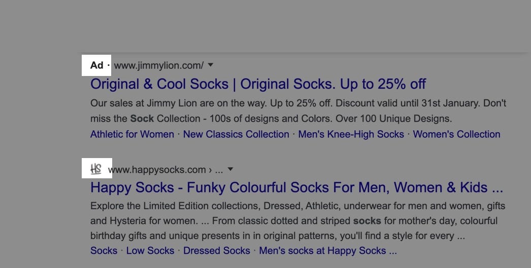
The latest Google search UI redesign sneakily tries to hack that behaviour by subverting how we quickly scan to see if something is an ad or a genuine result. Where once only adverts had an icon to differentiate them, now there are favicons in the equivalent slot on all other results.

Why do this?
By putting something visually similar in every slot which previously signalled an ad, it becomes impossible for a user to tell them apart without taking care and effort. Google can still say they label adverts, but that info is now buried under more visual noise.
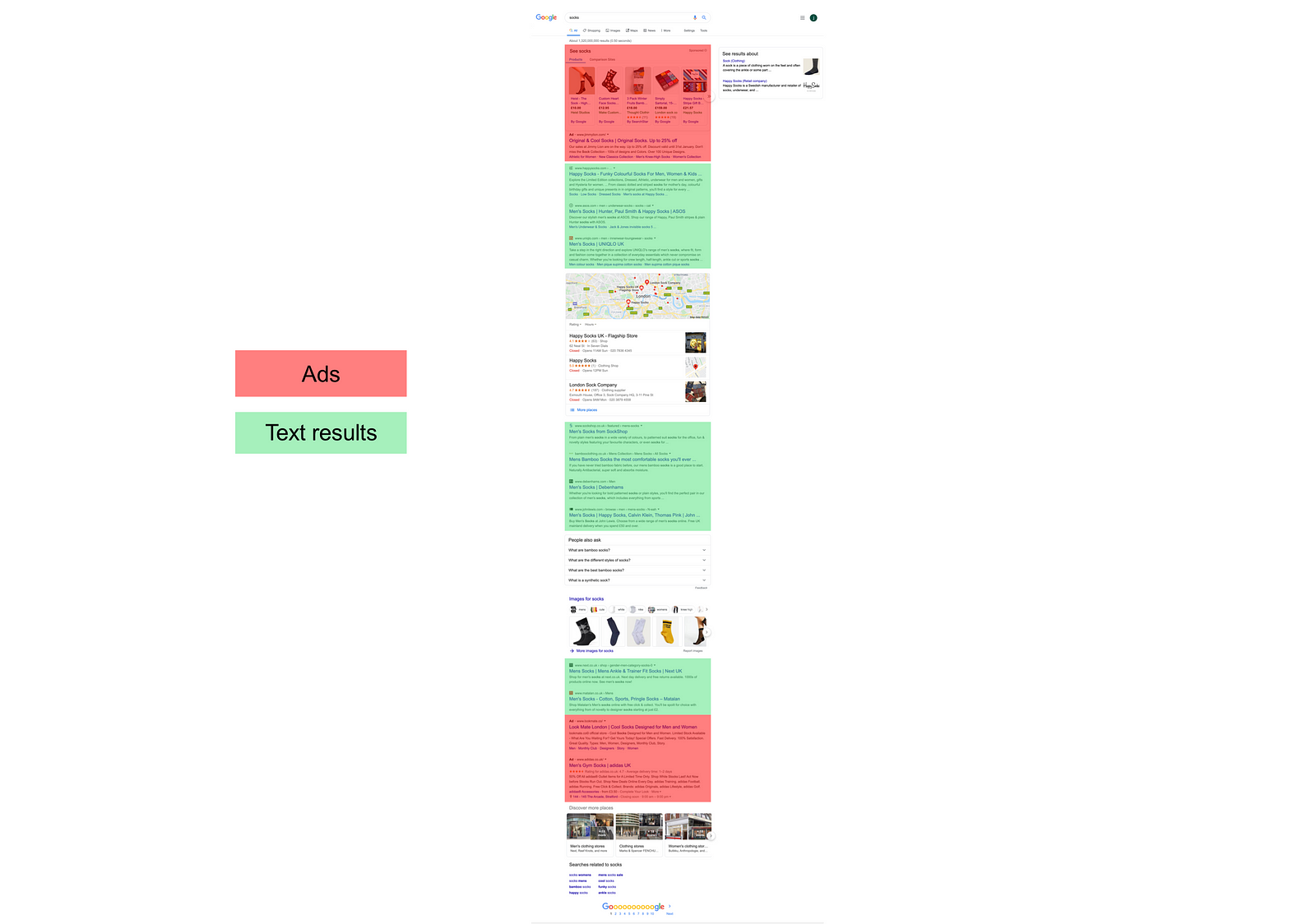
The real outcome? Increased advert density in search — ads can now be scattered at various positions in the results, and Google can substantially boost the number of paid results per page… without it being obvious.

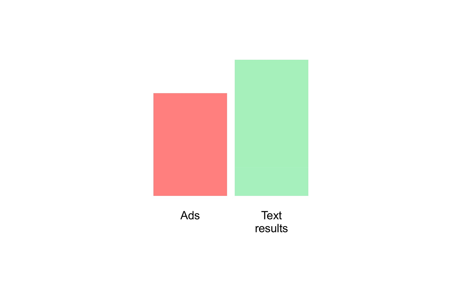
In this one example where I just searched ‘socks’, the ratio of adverts to text results was ~3:4. Now, considering that Google once differentiated itself with a clear, minimal UI, it seems that user experience is taking a hit here in pursuit of deeper monetisation of search results.

Google claims that the new format “puts a site’s brand front & center”. But if that was the rationale, wouldn’t it also make sense to do the same for adverts too, who are paying money specifically for brand awareness?
Up until as recently as 2013, Google actually separated ads in a separate section with a divider and a differently coloured background, making it clear which items had ‘won’ its position algorithmically, and which were paying to bypass the ranking and make it to page one.


Over the years, Google have been repeatedly reducing the strength of any visual indicators that gave away adverts; first removing the helpful background colour, then switching to a small (but at least solid) coloured icon, that too finally giving way to a thin coloured outline. The most recent iteration alters the (legally required) advert indicator to plain black text, and ramps up the noise on all other search results, burying the advert ‘signal’ to users.
This then, is just the latest step in a steady but determined progression towards hidden adverts.
What’s particularly ironic is that in the original research paper published by Google’s founders (Brin and Page) at Stanford, they discuss how advertising can destroy the quality of a search engine:
“We believe the issue of advertising causes enough mixed incentives that it is crucial to have a competitive search engine that is transparent”

In particular, Brin and Page talk about how previous search engines failed because they biased their rankings, selling positions in organic search without being transparent.
And now, with ads hidden amongst real results, Google too moves closer to hidden bias, something described by Google’s founders as:
“much more insidious than advertising, because it is not clear who ‘deserves’ to be there, and who is willing to pay money to be listed.”

The clear outcome for users is a worse searching experience, with less relevant results claiming top spots in the results, but without the clear indication that they paid for their position rather than earning it through relevance.
Purely as a witness, it’s fascinating to see Google degrade their core product for deeper search monetisation — something that is generally not an option without some level of monopoly securing your position. This design change then, like those incumbents that came before Google, might be one that begins to offer market share to search startups pursuing uncompromised honest and relevant results, just like Google’s founders also set out to do.

