5 Things I Learnt as a Designer at LEGO

At 5am on a cold, misty morning, my plane tumbled to a stop in a strange land where I didn’t speak a word of the language. I was about to embark on one of the best (and most bizarre) adventures I’d had so far — working as a designer at LEGO HQ in Denmark.
I was fresh-faced, just a few weeks after finishing university, and about to be thrown into the deep end of my first real design job.
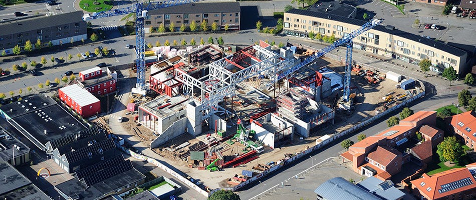
Over the course of my time there, I would work on a secret project, a real life‘LEGO House’ — a 12,000 square metre new spiritual home for the cult brand, standing 23 metres tall. The ‘House’ was to be filled with slightly surreal digital and physical experiences showing the values and future vision for LEGO.

That sink-or-swim experience influences much of my approach today. Here are the top five things I picked up inbetween all of the pickled herring, liquorice-flavoured everything, and hygge*.
*Don’t ask.
1 — Every point of the experience matters
Often as a designer or entrepreneur, the focus is on the product, testing learning and shipping — however, the product is merely one piece of the experience puzzle. Where are the users when they interact with it? What were they doing before? How did they discover it? What will they do after? These are all part of the broader product experience. Every product, whether it may seem like it or not, is a service of some kind, and needs to be considered holistically within the user’s journey.
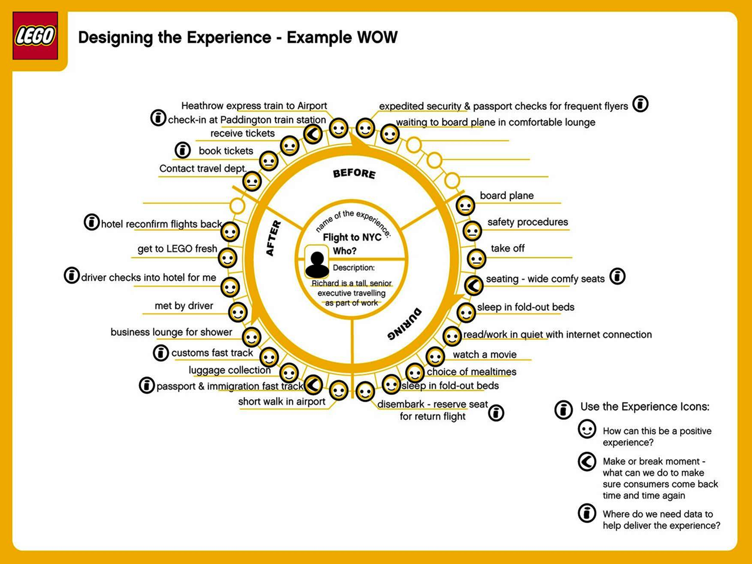
At LEGO, the approach is to actually map the experiential journey that the product or service will exist within and seek to understand how that can be made better.
Below is one of the tools LEGO uses to plot the user’s mood across the various touch-points of the journey, diving into how the user feels and their situation at any one moment.

Every pain point is an opportunity to be won or wasted, and can add to the product experience… or easily subtract from it.
2 — Build play in
For a product to be truly sticky, it needs to be more than functional, connecting on an emotional level — to be a joy to use… like, actually fun.
Of course, this doesn’t mean throwing unnecessary animations in left, right and centre. The user’s path to completing a goal within the product should never be impeded by pointless fluff, but there are always novel ways to accomplish a task or fun elements can be embedded into the experience.
This is a key part of the LEGO philosophy; embed little surprising moments of play into everything. Although perhaps this isn’t surprising for a toy company.However, this approach is now being applied in markets where it wouldn’t have in the past — take the popular example of Slack, which sits in the ever so lively enterprise communication space… with other fun products like… Lync and Yammer. At the end of the day, any product will be used by real people, sobuilding small moments of delight (what designer Oki Sato calls ‘!’ moments)can be the difference between success or sighs.
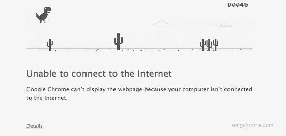
Some nice examples:


3 — Think with your hands, not just your head
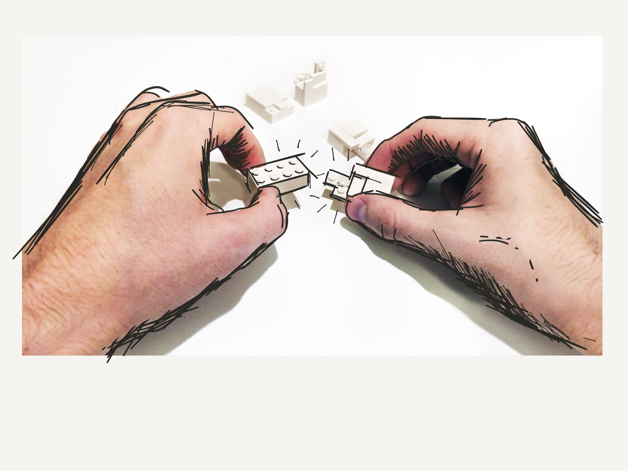
Make it real. At LEGO, I had the pencil snatched out of my hand and was told – don’t sketch it… build it.
You can perceive the form and functionality of anything so much better once you make it more tangible, and realising something in physical form is one of the best ways of doing this.
Foam models and paper prototypes may seem crude and childlike next to CAD or wire-framing tools, but absolutely nothing beats sense-checking in the real world — the sooner something can be tested, the sooner it can be improved.Something that is astoundingly obvious when you are holding a physical model in your hand and trying it out may be completely lost in the 2D world of a computer screen or on paper.
Get it off the paper.
4 — Don’t be afraid to dismantle to find a better way
Sometimes the only way to fix something… is to take it apart and start again.
When something doesn’t work, it is all too easy to try to fall into the trap of simply fixing it, which will get you back on track as quickly as possible. But this misses the real opportunity, which is to actually re-build with a new understanding of the previous design’s weaknesses.
Just as with making something out of LEGO; it’s always quicker to create something a second time, because your understanding of it runs a little deeper. You know where the awkward parts are, so you can change your approach.
Although it can seem crazy or painful to start again or intentionally break apart something that you put time into creating, the end result will be all the better for it.
5— Simplicity is strength
In the same way that Twitter’s famous 140 character limit frees people from the burden of producing a masterpiece, (and led to significant growth in its early years) LEGO frees people to build quickly, effectively — but most importantly, roughly.
Roughly? Lower fidelity lowers the barrier to entry — everyone can try and anyone can succeed. There is no wrong way to connect simple plastic bricks, and no wrong way to tweet. It is a playground safe from failure. It is much in the same way that many are hesitant to draw in front of a group or are put off by the pressure of a blank page (just think about how often you hear the phrase: “but I can’t draw!”). Whilst drawing may offer more scope and depth,there also comes the perception that someone can miss the mark… creating a subconscious barrier to entry.
Less allows for more.
6 — Allow the plan to change
Yep, I know… I said 5 at the start. But sometimes you have to be prepared to change the plan or break the old structure when it no longer fits or works the given task. Sometimes you don’t know exactly what you are about to create or what the outcome will be, and that’s ok. Let the plan change.

